Final Project Write-up
Abstract
To some, basketball is great sport/entertainment; to some, basketball is an experiment run over and over again that tests the hypotheses of which styles, strategies, combinations and cultures produce the best performance on the hardwood floor and the statistics are the best indicators with a great variation of implications.
My visualization takes in the data of NBA player statistics (processed by Basketball-Reference.com) broken down by teams and positions (Center, Power Forward, Small Forward, Shooting Guard and Point Guard) that allows users to actively observe the trend of NBA players as a whole as well as individual performances through all possible combinations of stats comparison.
Introduction
As an avid basketball enthusiast, I want to explore the NBA world with a new perspective and data visualization allows me to go beyond just being fan and tell stories behind the numbers. Specifically, I want to see patterns of players within each of the five traditional positions. Which groups of players specialize in which fields? Are there less obvious trends or correlations between some statistical categories? What if people understand basketball differently and rather weigh in statistical categories differently? Are there more detailed breakdowns or clusters with different scenarios? These are the questions I often ask myself. To answer these questions, I found this set of player stats data (from Basketball-Reference.com) that has detailed stats of each player in the NBA from the 2014-2015 season, including his team and position.
Therefore, I want to create visualization that shows player-team-position relationship directly as well as the distribution of all statistical categories. It would also help if it can show correlations of statistical categories that are not usually discussed (like Total Rebound vs. Free Throw). I also want to build a platform where users get to decide weights of all statistical categories to generate a player cluster graph. Most importantly, what will set this apart from some plain excel charts is interaction; that is, I provide all possible combinations and options through my visualization and anyone will be able to play around with the visualization until they find the version they most resemble to.
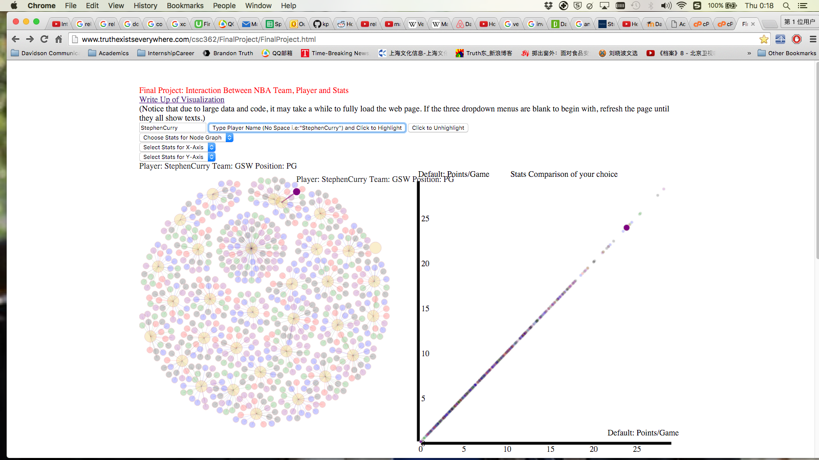
That being said, my visualization consists of three parts (in addition to the legend). The first part is a force-directed graph that connects each player node with his team node and each node is colored by positions. Also the first dropdown menu allows users to look at any stats and compare individual player performances. The second part is a scatter plot of stats comparison of your choice. In the next two dropdown menus, users get to choose which two stats to study and then observe correlations between stats. (Default is Points/Game vs. Points/Game). This allows users to have a first look of patterns within each position (by color) and potential trends of players as a whole (correlation). The last part is also a scatter plot that's called player cluster graph, with its y-coordinate being the position and its x-coordinate being the cluster score, something that users get to decide by choosing different weights for different stats. (The cluster score is the weighted sum of player's z score in each statistical category.) Underneath the graph, there are input boxes for users to fill in and submit; different choices of weights of stats will generate a different cluster score for each player and thus a different player cluster graph.
All parts can be zoomed in and out and dragged around since some nodes are too small to read.
What my visualization accomplishes the most is, as I have emphasized, the user interaction. My goal is to not only visualize but also allow users to freely explore in their own perspectives.
The Visualization - Interaction of Stats
(Notice that due to large data and code, it may take a while to fully load the web page. If the three dispatch bars are blank to begin with, refresh the page until they all show texts.)
There are two visualization guidelines that I have followed throughout my design.
1. "Design graphic representations of data by taking into account human sensory capabilities in such a way that important data elements and data patterns can be quickly perceived."
2. "Greater numerical quantities should be represented by more distinct graphical elements."
My main graphical representations of data are positioning, coloring and sizing.
In my first part of the visualization, the force-directed graph of player-team relationship, there are multiple interactions. Firstly, the center orange node of each cluster of nodes is a team and the nodes connected to it are the players of that team. A team node is in orange color, whereas a play node is colored by its position, explained by the legend in the bottom right part of the web page. You may notice that there is a "team" node with extraordinarily many player nodes connected to it; that "team" is called "Players that were traded". Due to the special collection of the data, if a player was traded in the middle of last season, then that player would have multiple data entries: a player data entry for each team he played for and one more player data entry which sums up the overall performance of this player, and that cluster of player nodes entails all the players who were traded in the middle of last season. When you hover on each node, it will give you detailed information about that player or team. The first dropdown menu above the graph "Choose Stats for Node Graph" allows you to compare individual player performance within each statistical category. Whichever stats you choose from there, the sizes of the player nodes in the graph change according to each player's numerical value under those stats. For instance, by choosing "PTS", the radii of the nodes will be proportional to the points of each player per game. Moreover, with the coloring by position, you can see how each position as a whole perform under each category. What's more, I added a search box on top of the dropdown menu so that you don't have to hover around the graph to find your favorite player. You can just simply type a player's name and its corresponding nodes will stand out through all three parts of my visualizations. However, due to technical restrictions, you have to type in the player's full name correctly without space in between (because d3's id system doesn't work with space in it). So if you choose "PTS" from the dropdown menu and type in "StephenCurry", you will immediately find out how Steph does in scoring last season. To undo, simply click on "Click to Unhighlight". You are able to examine the players’ stats by stats, either as a whole or individually.
The second part of my visualization is inspired by my curiosity of if there exists certain pattern in certain categories of certain positions. It sounded like an ambitious question so I created this super interactive scatter plot. It is a scatter plot that displays all players' stats in any combination/dimension of two. In other words, the bottom two dropdown menus above the force-directed graph allow the user to choose which statistical categories for either X- or Y-axis. (The default is Points/Game vs. Points/Game.) In this way, users can discover patterns or correlations from a combination of any two statistical categories that any ESPN analyst has barely talked about before. Again, by hovering on the nodes, the graph will display the detailed information of that player in the categories you choose. And again, you may also see some patterns within positions by looking at clustering of colors.
In both the first and the second parts, users can zoom in and out and drag to have a better look of each graph.
.png)
.png)
.png)
.png)
.png)
.png)
The third part is my favorite yet most uncertain part. This part is inspired by my desire to try to come up a way to cluster players into more than just the five traditional positions due to the trend of small ball in Nowadays basketball. I want to know if there exist internal breakdowns within each position and which new "clusters" are most efficient. Due to data restriction, this cluster graph is solely based on player stats instead of players' play style (Proportions of shooting, assisting, rebounding, etc.). That being said, the graph's y-coordinate is player's position; the x-coordinate is each player's cluster score, a weighted sum of a player's z score in each statistical category, where the weight of every category is decided by the user. Underneath the scatter plot, the user can type in their weights of each category, something that reflects their own understanding of basketball, and generate player clustering accordingly. You can also hover on any node and zoom in to have a better look at the display of more detailed information. With different clustering, there may be different patterns of players or internal breakdowns within each position (color). What's left unanswered is most powerful. Thus, I am able to provide a platform for other basketball enthusiasts just like me to study the game in different perspectives.
.png)
.png)
.png) Discussion
Discussion
There are quite a few challenges I have encountered throughout the project. However, these are some pretty useful lessons I have learned as I code further on in the future.
The first thing would be writing the parser of the CSV file into JSON format. The actual parser wasn't the hardest part, but debugging surely was. If the JSON file didn’t match JSON format, the force-direct graph wouldn't show, if the file was only missing a coma or a quotation mark. To make sure the resulting text file has to match JSON format exactly was one of the most challenging and frustrating processes. What I learned was that computer is "stupid" in a way that we as coders have to take care every potential possibility to ensure that the result is perfect in any circumstance. What I eventually found out was an online JSON validator that tells me which part of my file is invalid. It also taught me the lesson of finding the shortcut to debugging based on the problem.
The other key issue I ran into was the "id" attribute of the nodes and circles. In order to make highlighting work, I need to use every player's name as the id for its corresponding node or circle (in scatter plots). However, at first it didn't quite work out the way I anticipated. After trying to debug for two days, I realized that it was the space in the names and I remembered we talked about it one day in class that the "id" system doesn't work if there is space in the string. So I went back to my parser and CSV file and replaced all space-" " with no space-"". Then problem solved.
The next challenge I ran into was choosing the color. Using d3.scale.category20() results in different colors every time since it's random. To make it consistent, I need to choose a specific color for each position. No more than 8 colors for categorizing is fine but choosing 6 colors for visual distinction was still challenging. I need to consider the contrast, user experience and possibilities of nodes covering each other. Eventually I settled with orange, red, black, purple, blue and green (I know blue recedes but it's really hard to come up with another color).
Conclusion
The final project is quite a success. What I have accomplished is that I have made my visualization interactive, which makes it stand out from plain excel charts or graphs. I intended to have it visually intuitive and usable and it has matched my expectation. If I had more time, I would do some research on the mathematical theory and applications of cluster analysis to have a more all-round design of my player cluster graph (metrics, axes, coordinates, etc.).
Works Cited
• Data: NBA Advanced Stats
o http://www.basketball-reference.com/leagues/NBA_2015_per_game.html
• D3: Force-Directed Graph
o http://bl.ocks.org/mbostock/4062045
• D3: Dispatch Event
o http://bl.ocks.org/mbostock/5872848
• HTML: Search Box
o http://webdesign.tutsplus.com/tutorials/css-experiments-with-a-search-form-input-and-button--cms-22069